2022-02-06
Experiments in CSS
2022-02-06 10:30The problem with any new social media site is setting up a digital identity, and on a site like this, that requires a great deal of graphical things. Icons, obviously, but also the overall design and layout of the blog. The provided default ones are not necessarily all my favorites, so over the coming days, I will probably experiment a bit with various adjustments. To do these adjustments properly, of course, I need some sample content here; something that looks very much like a typical post, so I can check whether what I'm planning actually works. This is that post.
As a result of that, you don't need to read this post. Though if you do, please leave a comment or whatever it is the people here do, so I can check the formatting for them! But really this is just going to be me rambling for a bit because that is more fun than googling for Lorem Ipsum, or copying a post from my tumblr. (This is a test for the styling of links, by the way). Graphics of course also require images, like icons, and I'm not sure I'm in love with dreamwidth's approach to them. Why do I always have to crop an icon when I upload it? These are icons that I've used for decades, and they are the exact size and aspect ratio that I like. I also really wish I could upload my icons as SVG, to retain their quality, but I guess that is too rare a requirement for them to implement. (Or is it? I actually haven't checked. Hang on… nope, doesn't work.) I'm also not sure whether there are Javascript security issues here. Want to find out together?
The other big issue is actual images in the context of the post itself. My initial impression is that the Dreamwidth workflow for that is terrible, so I probably won't use this feature that much, but I guess it's still worth exploring.

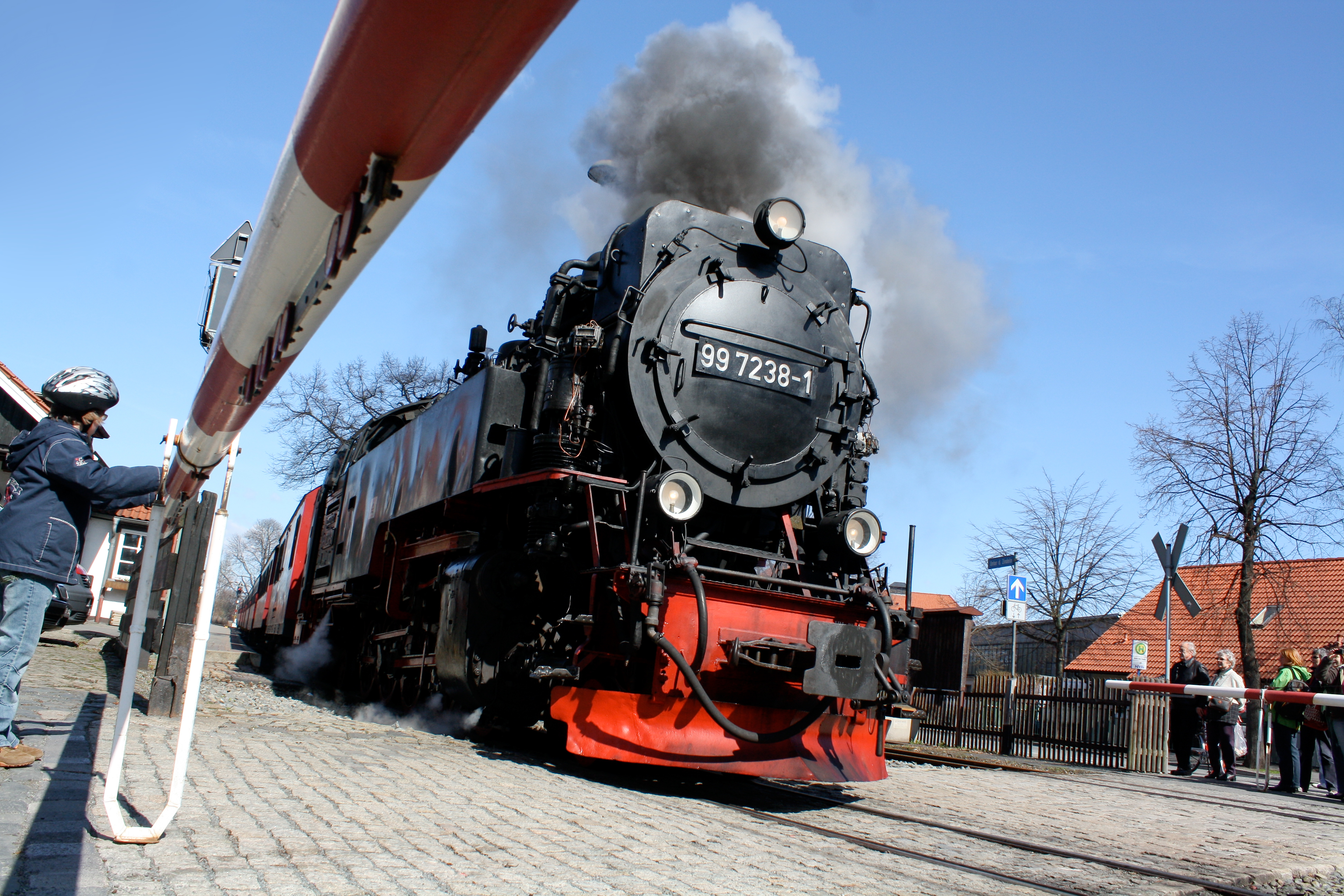
Okay, I don't think I'm doing this properly with this image. This is yet another annoyance of Dreamwidth. Others include:
- Having to write HTML manually instead of providing Markdown. Yes, I know there's a rich text editor, but I don't trust these things.
The name is just stupid. Dreamwidth? I suppose that comes from Bandwidth, but for dreams? Still, I can't help but wonder about Dreamheight and Dreamdepth, and I'm sure I'm far from the only one who has ever made that joke.
I suppose it's not that terrible, and I've gotten used to Archive Of Our Own, so what can I say.
- What's definitely true is that this site feels very 2004 era, early web 2.0. The tiny fonts everywhere (that's definitely going to change on my blog), the overly sugary and incredibly tiny icons, the way there's a "mood" and "music" section under each post, it all makes me feel like I'm back in my early DeviantArt days.
Of course, none of these things really matter; Fanfiction.net is worse (I do have a presence there but I only ever cross-post things from Ao3 there these days) and still incredibly popular. What matters is the community. Finding out what that's like will be the most important part for me over the next few days and weeks.
Alright, I think that's enough content to test my CSS, isn't it? Maybe a bit more, just to be on the safe side. I have to admit: I hate CSS these days. Oh, sure, I started with web development in the late 1990s, I am familiar with it, but there was a point many, many years ago when I stopped being interested and decided to work on native apps (and these days microcontrollers) instead. It's so finicky, and I'm never super satisfied with the result. So it will probably take me some time to figure out.
If you've made it this far, thank you, and please leave a comment about the nature of styling of comments so I can check the styling of comments!
Okay, I think this page design is now in a shape that I'm generally okay with. I've spent arguably too much time on it, to the point where there's basically nothing of the original design left. Next up: Writing some content here that isn't actually about me being here. Eventually…
Feel free to look around the page and poke at stuff. It fully supports dark mode; if your device switches to dark mode, the site will switch as well, immediately. I don't normally use dark mode myself (I only implemented it because it was a fun challenge), so if you think there's something I can do better, do let me know.
That applies in general: If you have an issue or think something doesn't work, or think something is exceedingly ugly, don't hesitate to leave a comment (and please indicate what device you're using and whether you're in dark or light mode). I already have a list of things I don't particular like and might tackle in the future:
- Colors for links are a bit all over the place.
- The way the date is shown for comments that do not have a title takes more vertical space than I like.
- The dot for the crossing of the blue and purple line in the header is slightly too far to the right in light mode (I've already fixed it for dark mode).
- I got rid of the user icon on articles because I couldn't find a place for it, but then I realised this stupid site shows the "Reading page" in my own blog's design, so I guess I'll have to add them back, because otherwise it's too confusing.